Typography · Editorial
Coursework, FLAME University
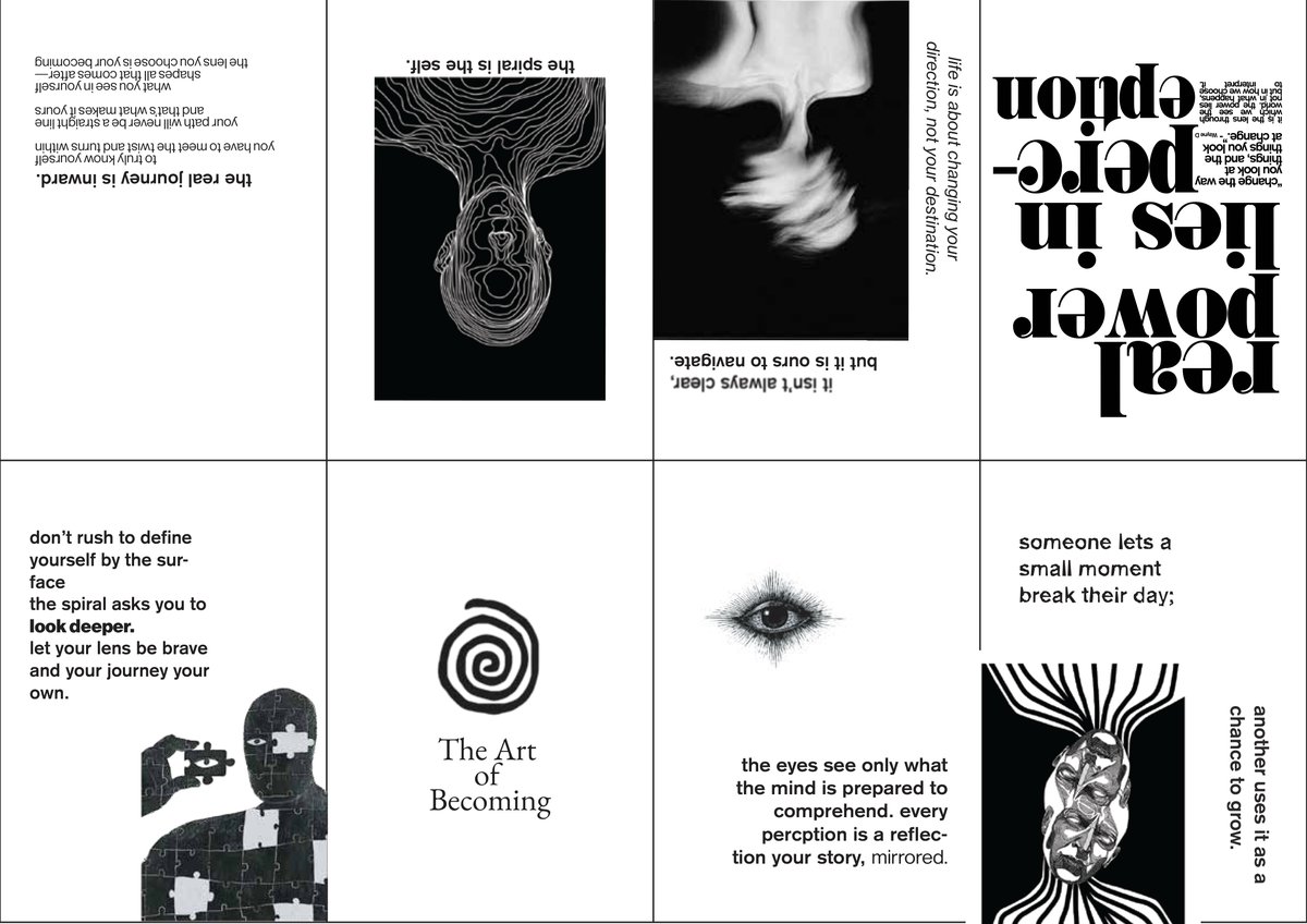
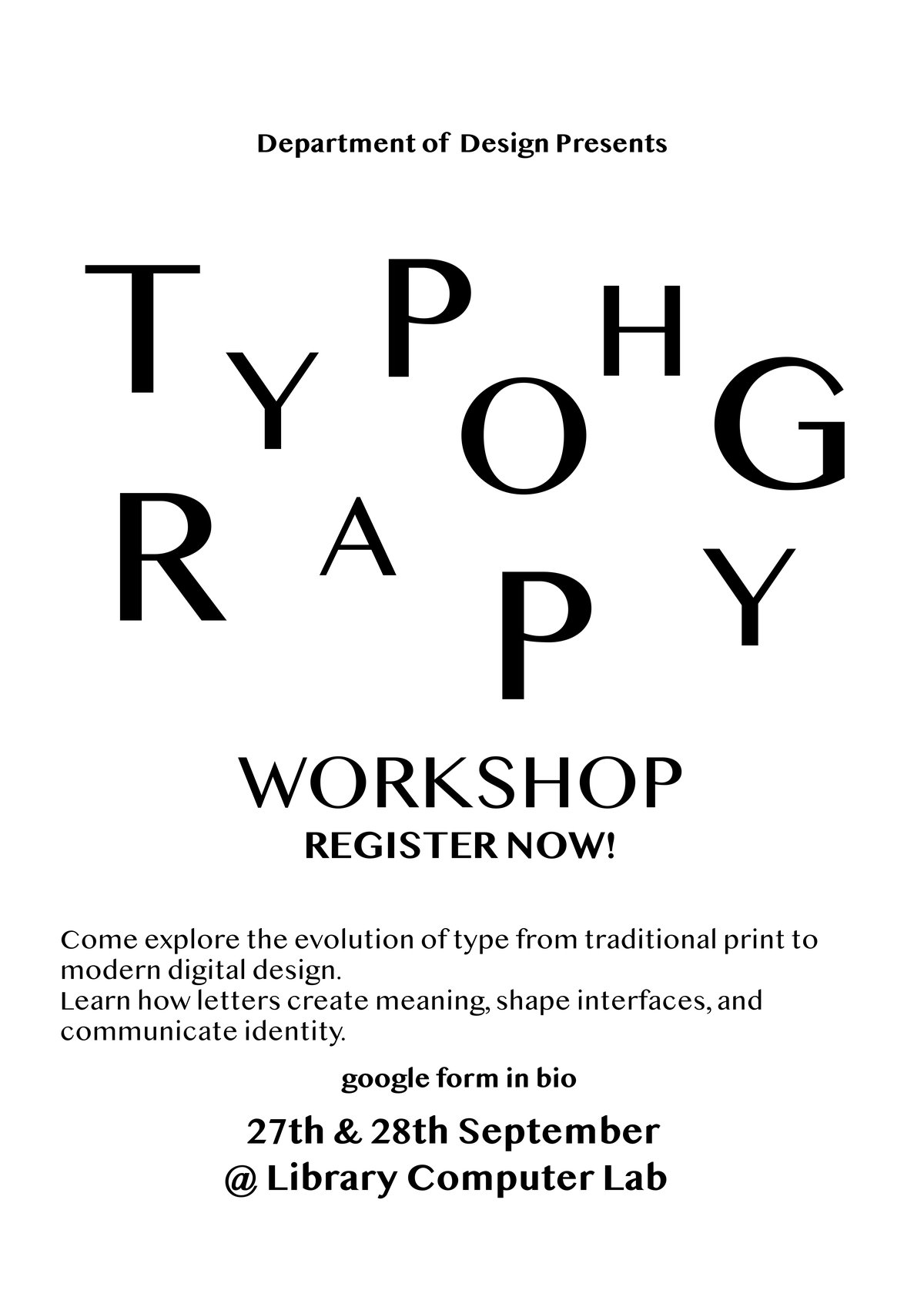
A body of type-first work spanning a stationery/letterhead system, an expressive poster series, an infographic on India's air pollution, and a flippable zine, "The Art of Becoming," built around a single idea: the spiral is the self.
A personal letterhead and business-card system built as a type exercise, practicing hierarchy, spacing, and restraint before applying the same logic to a mock studio identity (letterhead, envelope, and business correspondence). The whole system is laid out in the stationery PDF ↓.
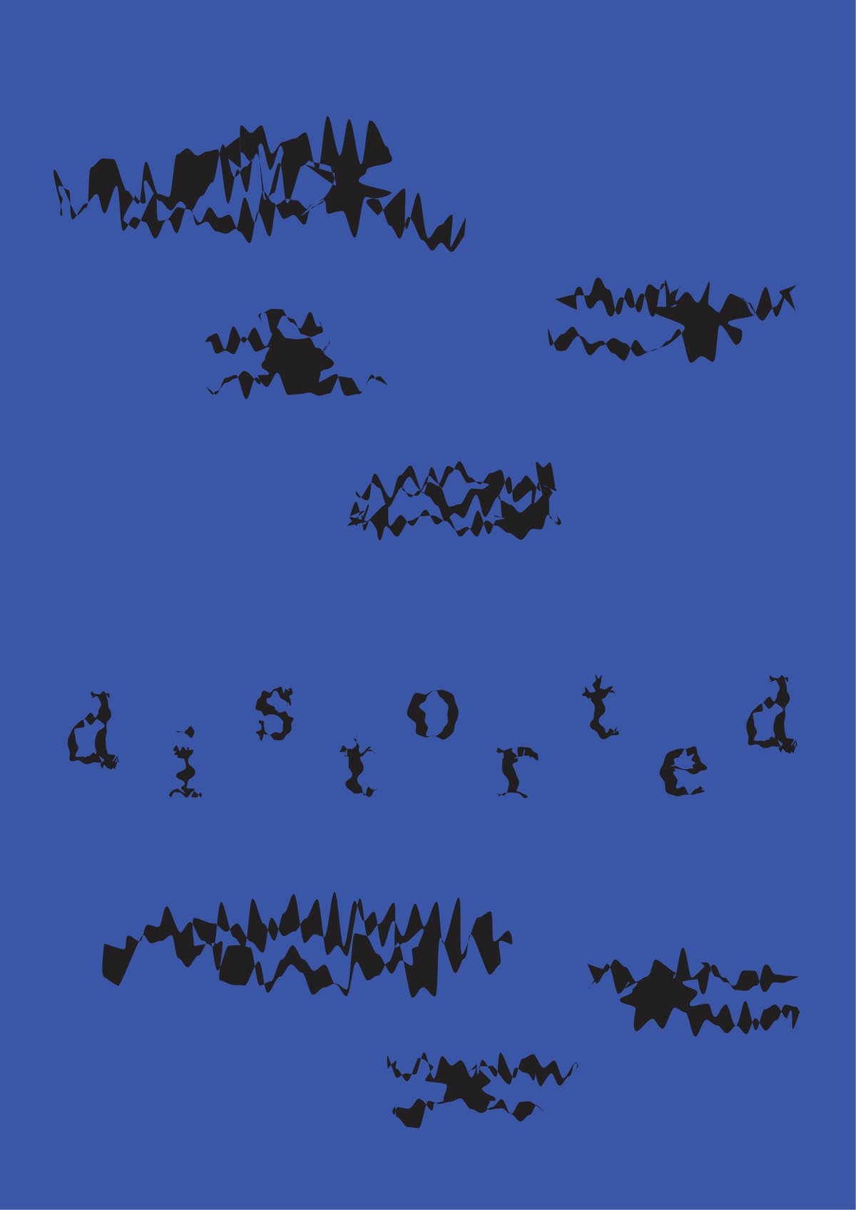
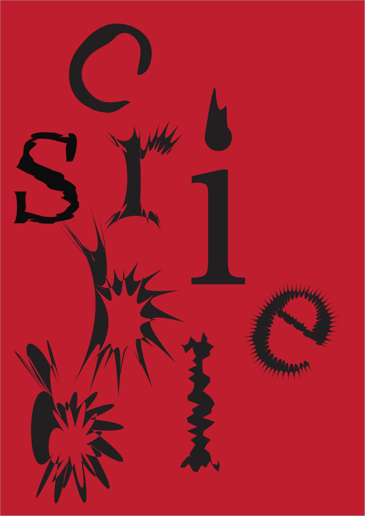
A run of posters built entirely from type gone physical: words like "distorted," "melt," "shatter," and "jump" rendered as warped, jagged, or exploded letterforms on bold flat color, treating each word's shape as its own illustration.
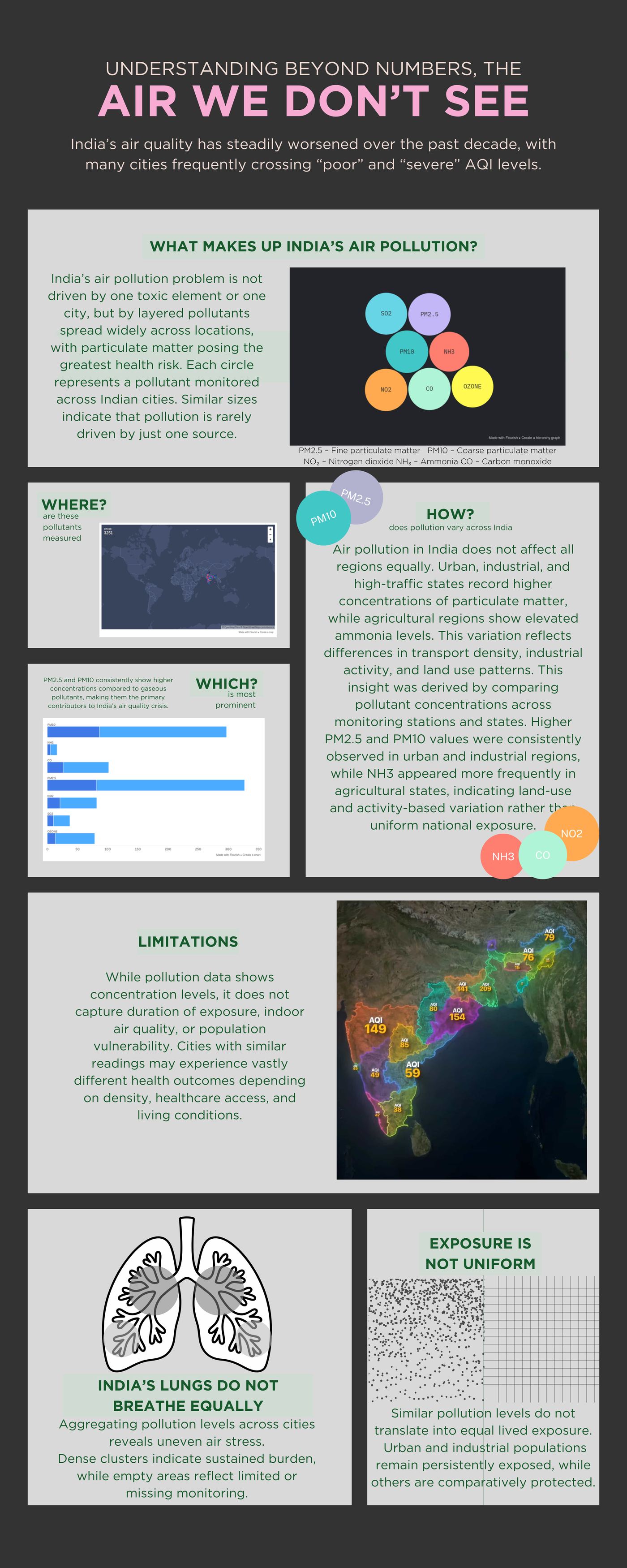
An infographic poster distilling research on India's air pollution into a single, legible visual hierarchy, where data becomes readable at a glance.
A personal essay zine built around one image, a spiral, as a metaphor for self-perception and identity. Laid out and folded as a print zine, then digitized as a flippable book so it reads the way it was designed to: page by page, in order. Flip through it below, or read the print version ↓ as it was laid out for paper.