UX Design · Concept App
Solo project, UX/product design, started 2 years ago and still evolving
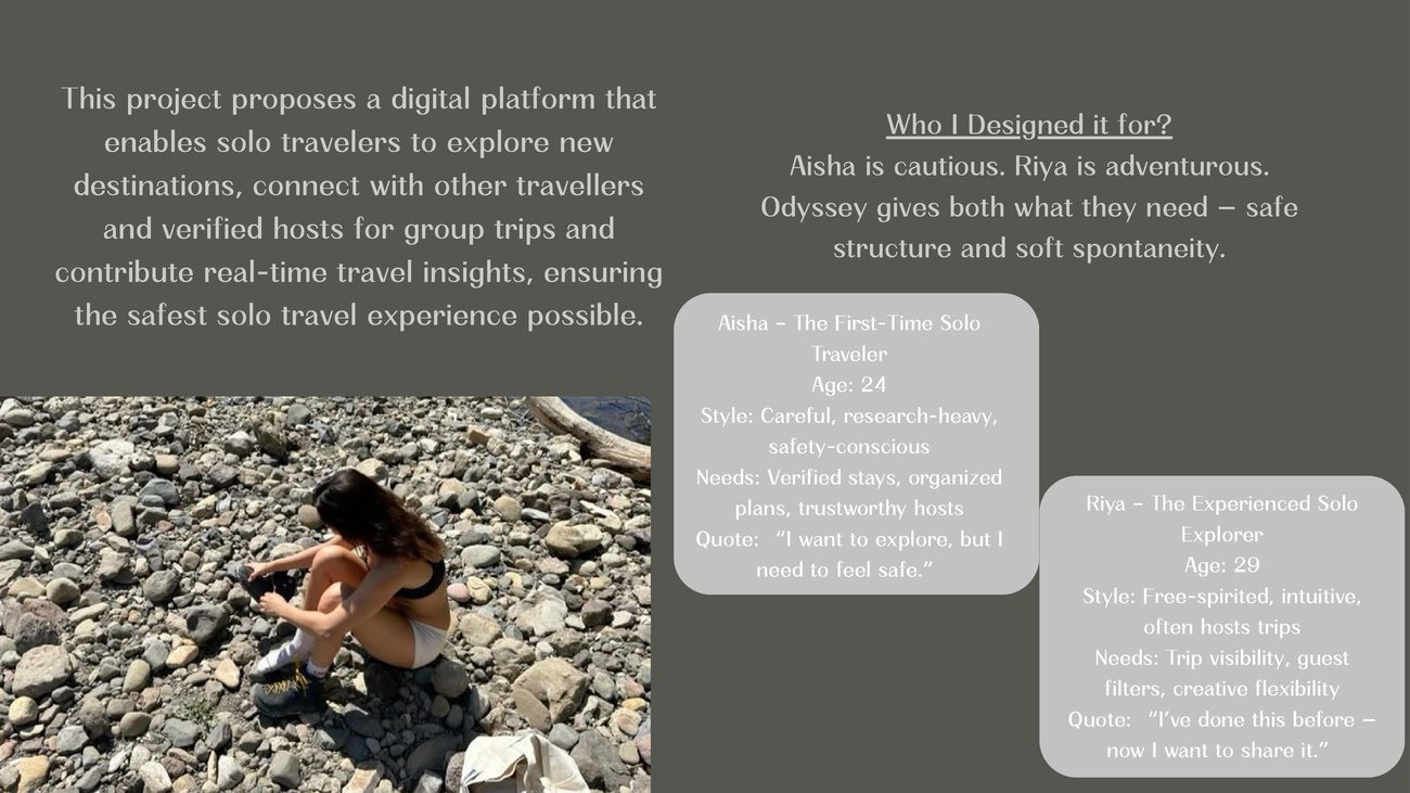
A concept app for solo travel, designed around one question: how does a young woman travel solo in India without spending the whole trip worrying about safety? Odyssey is built on verified experiences from real solo travelers instead of generic listings and unreliable reviews.
Solo travel is gaining popularity worldwide as people seek independence, adventure, and self-discovery, but it's still genuinely hard to do safely. Unsafe or unverified hosts, flaky plans, no real community, and no real-time insights. Through interviews with six potential users, some experienced and some first-timers, one truth kept coming up: people want safety, but they also want spontaneity. They crave connection, but not at the cost of control.
Two personas anchored the design: Aisha, the first-time solo traveler, careful and research-heavy and safety-conscious, wants verified stays and organized plans but is nervous about going alone. And Riya, the experienced explorer, free-spirited and intuitive, wants trip visibility, guest filters, and creative flexibility. Odyssey had to give both of them what they needed: safe structure and soft spontaneity, in the same product.
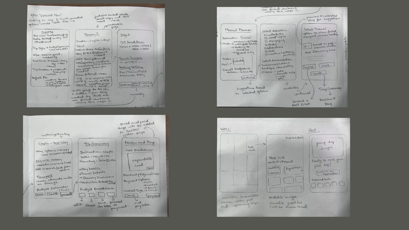
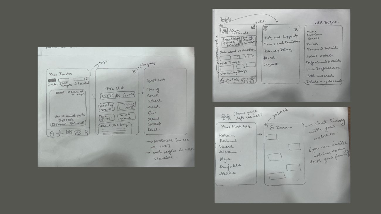
I followed a user-centered design strategy built on three pillars: intuitive interactions, emotional comfort, and safety-first decisions. Before touching visuals, I sketched over 35 screens to work through user flows, emotional pacing, and layout clarity. I mapped three core task flows: solo trip planning, hosting a trip, and group travel matching, using cognitive psychology and mental models to organize the app into categories people could move through without friction.
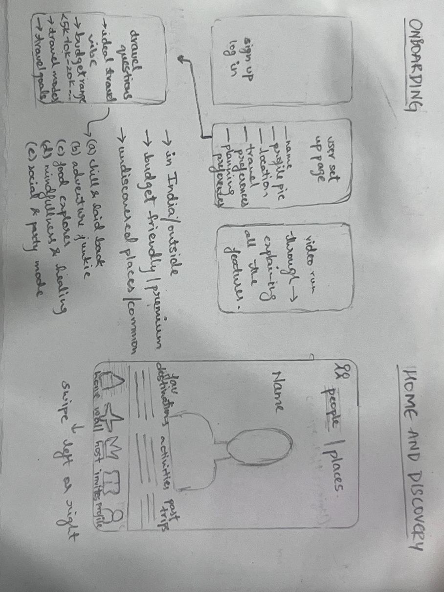
I ran informal usability testing sessions on the low-fidelity prototype with solo travelers, students, and travel enthusiasts who matched the target audience. That testing directly reshaped the design. The onboarding flow became progressive (one question per screen, with a progress indicator and a "skip for now" option), CTAs got simpler, and the color palette shifted toward something calmer and more trustworthy.
I wanted Odyssey to be sustainable and scalable without losing the soul of the product: a freemium model, with the core app free and premium features like curated trip bundles, exclusive invites, and one-on-one host experiences unlocked for paying users. Longer-term, revenue comes through affiliate links and partnerships with ethical, travel-related brands. But the actual moat isn't monetization, it's the community: user-verified content, real-time insight, and a space people feel invested in.
It's not a live app. This was a project I started two years ago and still love, and I'm currently redesigning it. The full high-fidelity prototype lives in Figma; what's shown here is the process work: research, personas, and the 35+ hand-sketched screens that got me there, all collected in the full project deck ↓. Click through the interactive prototype below to see how it actually flows.